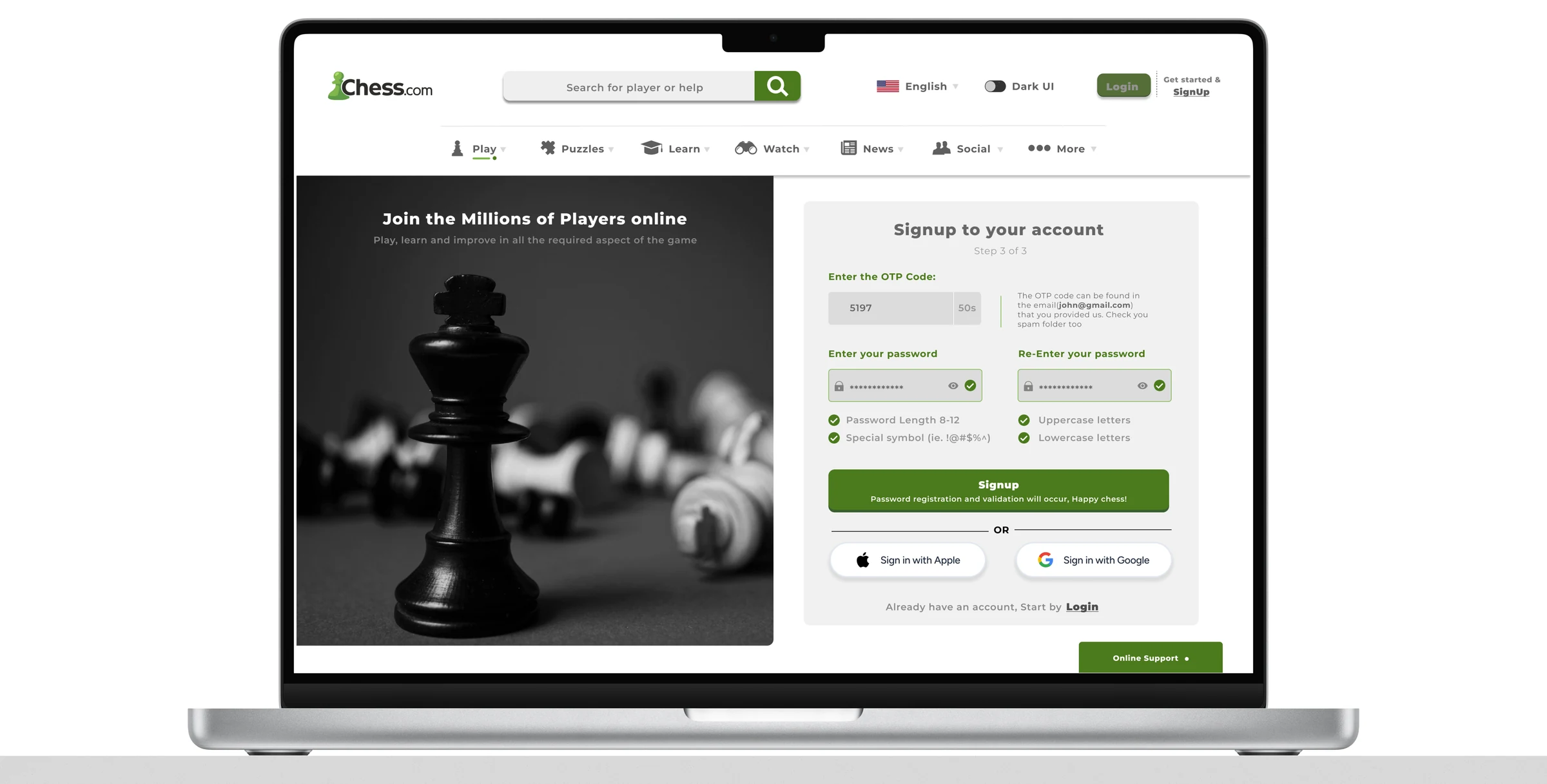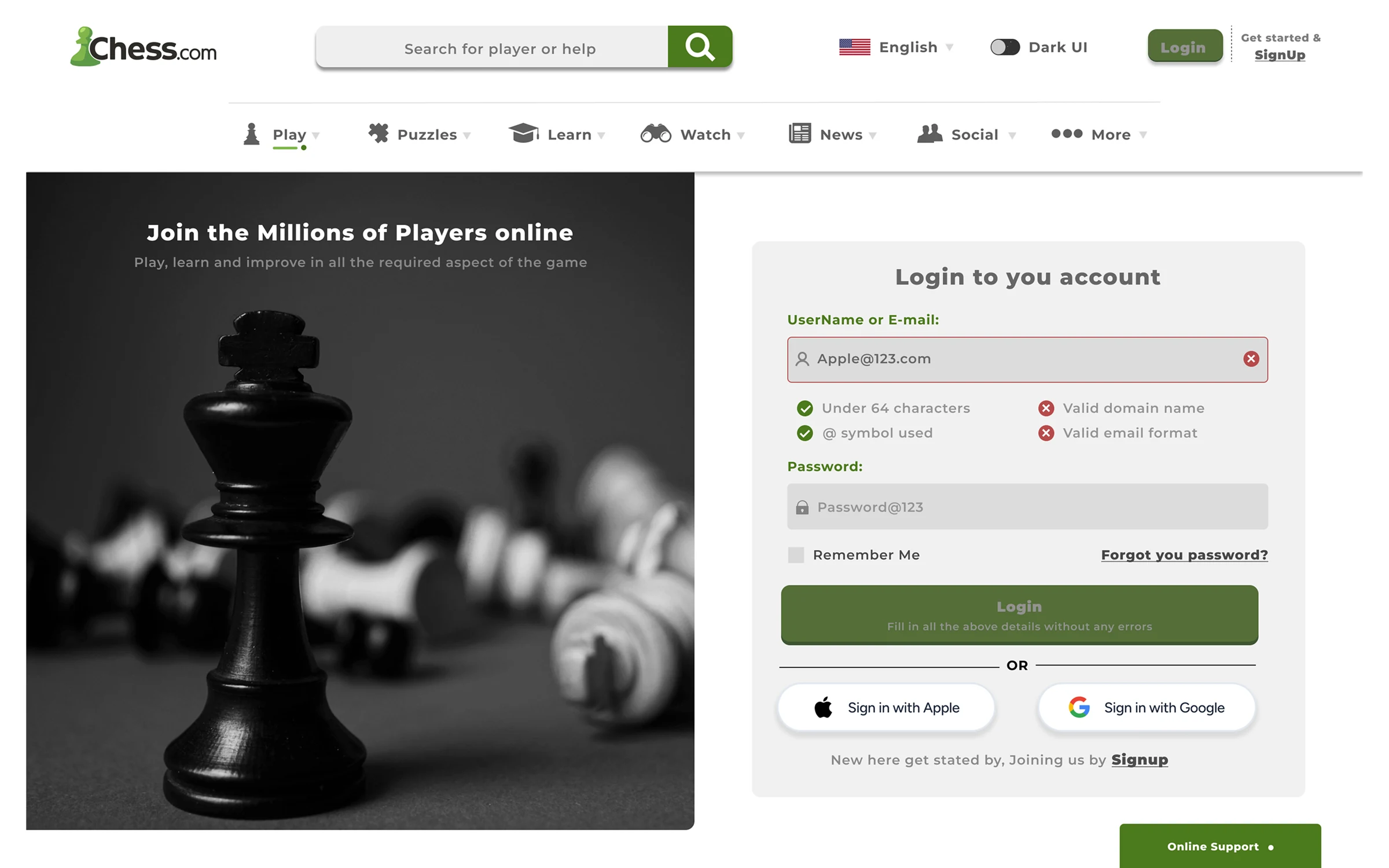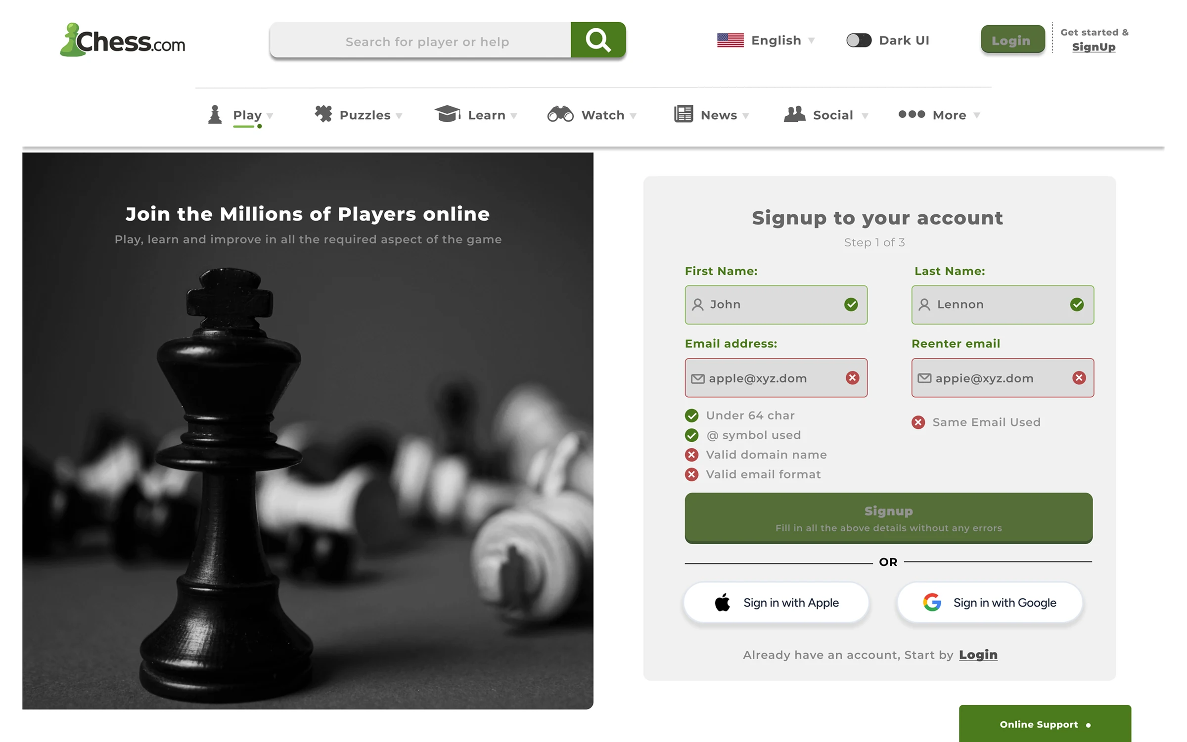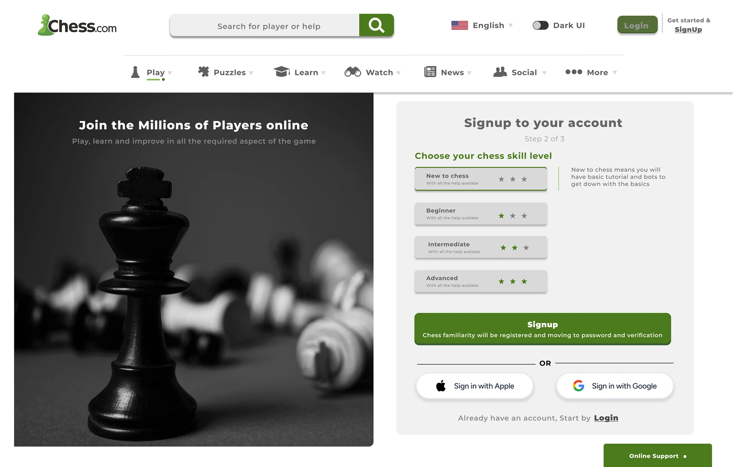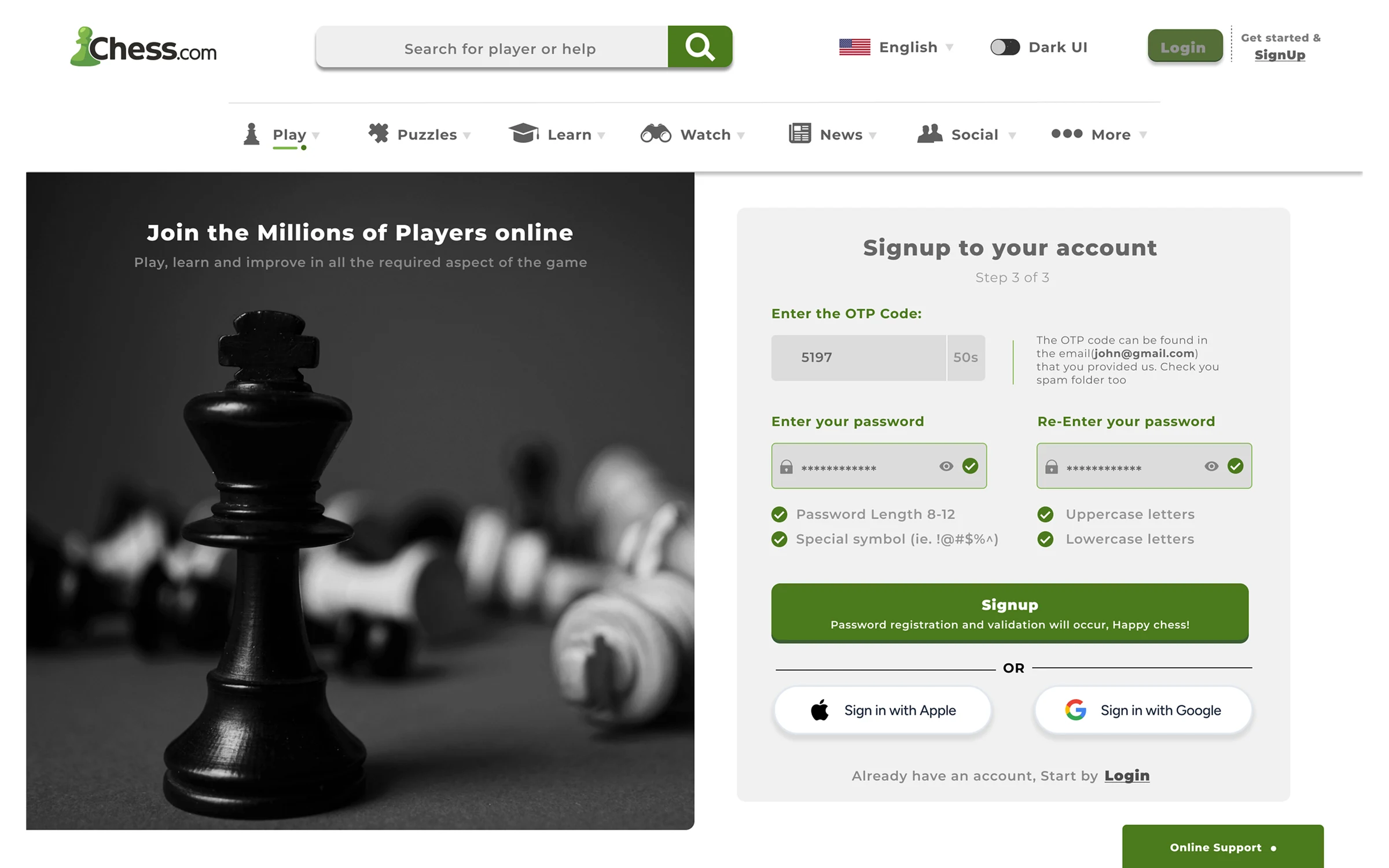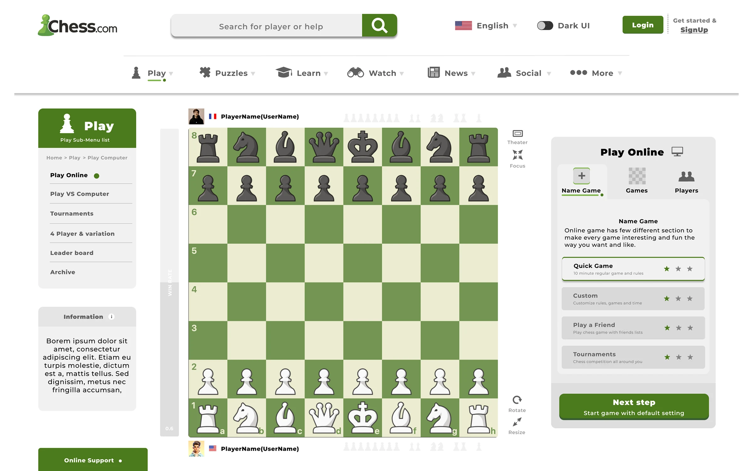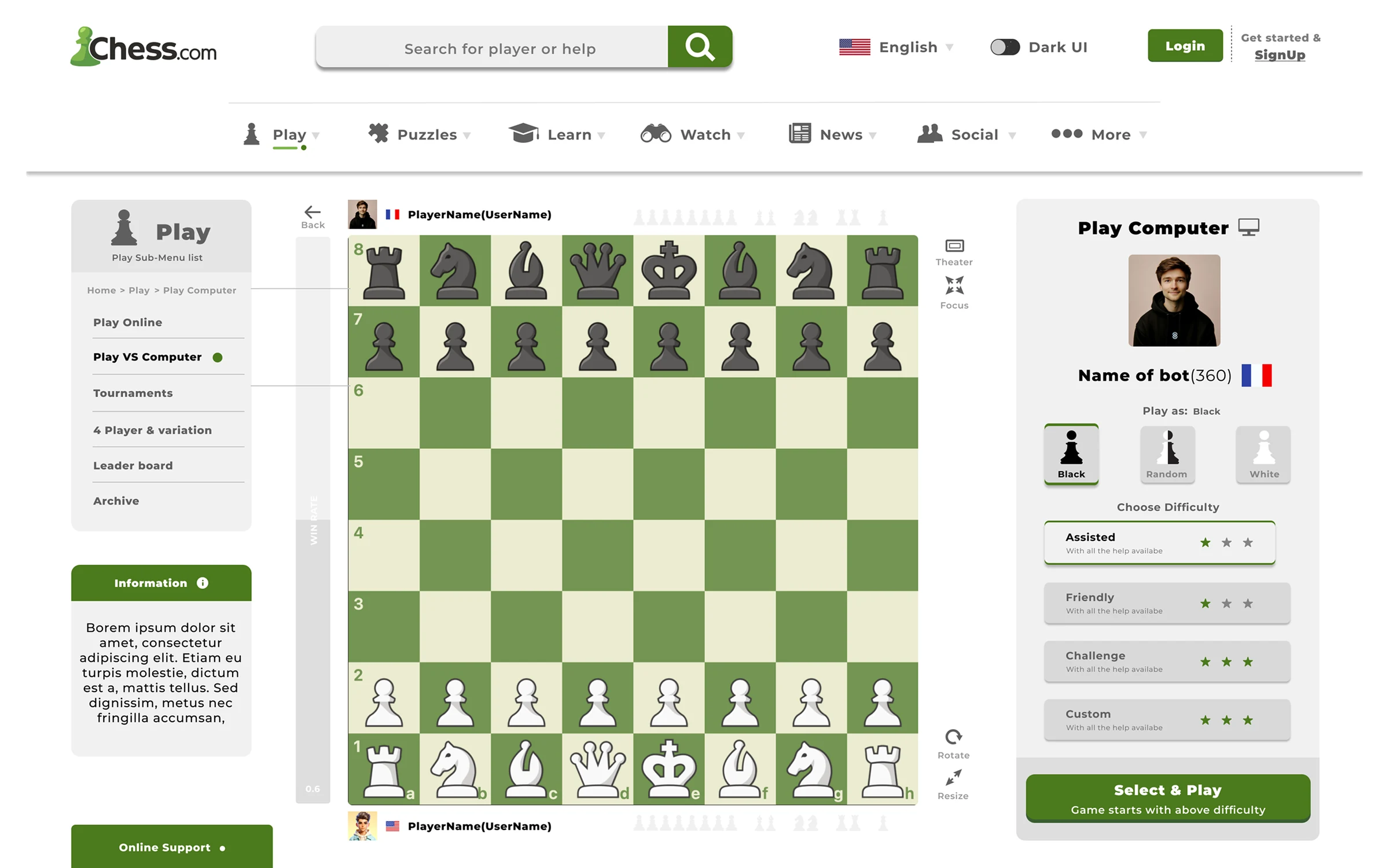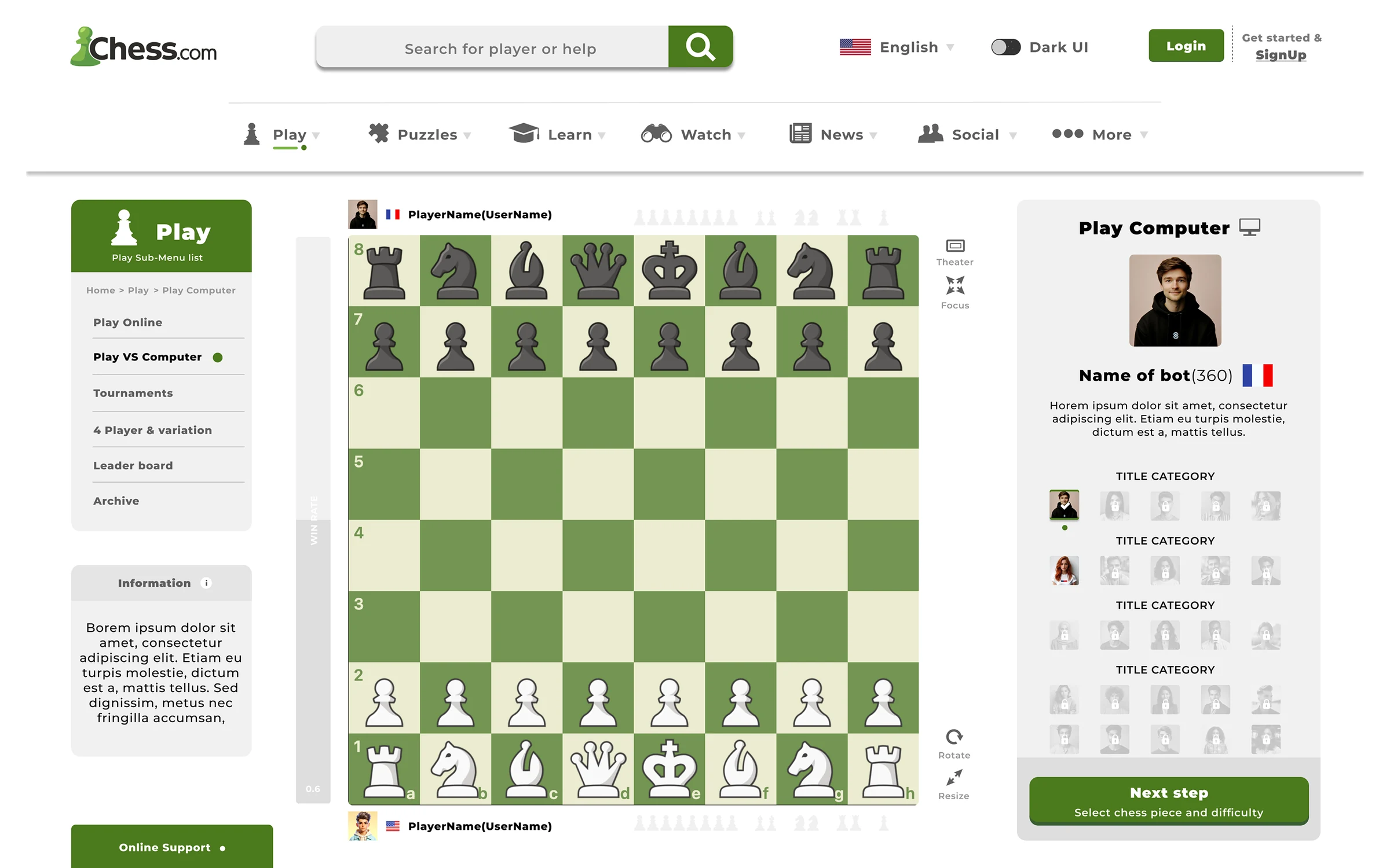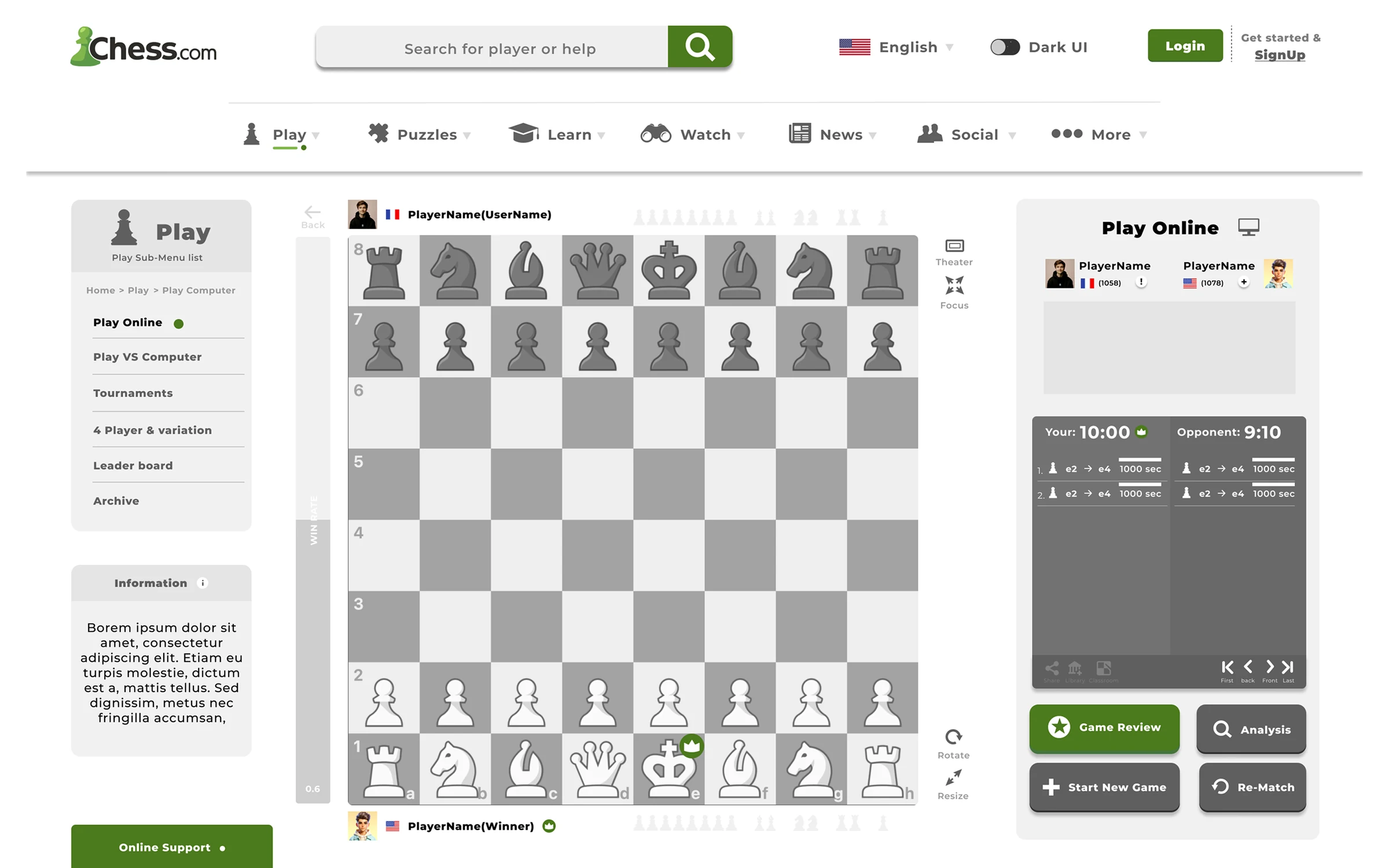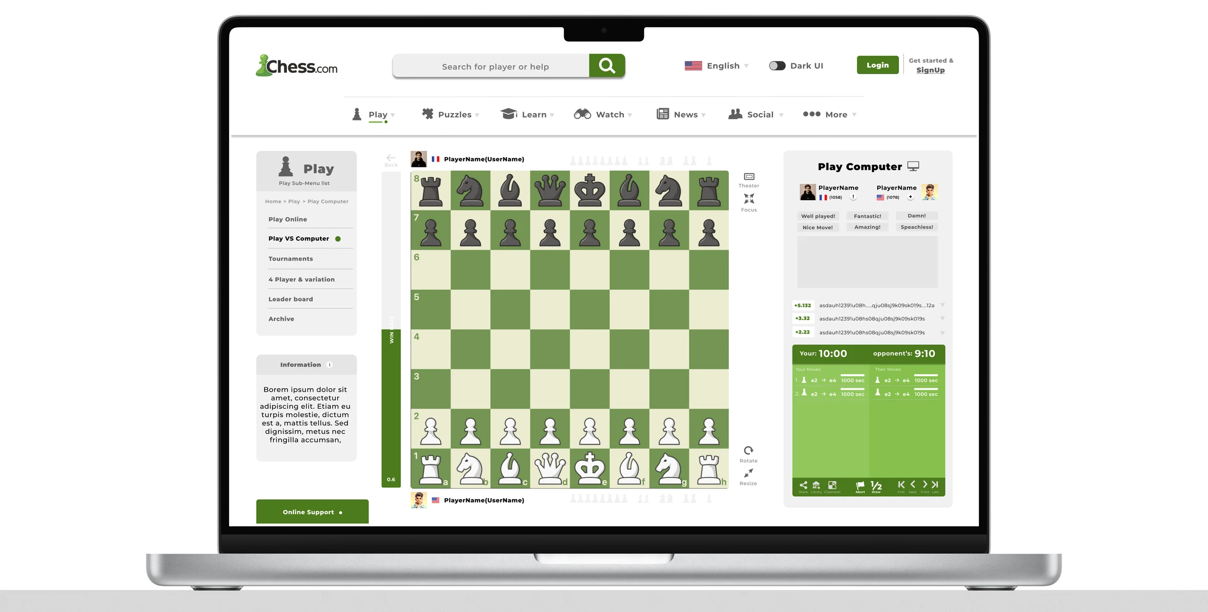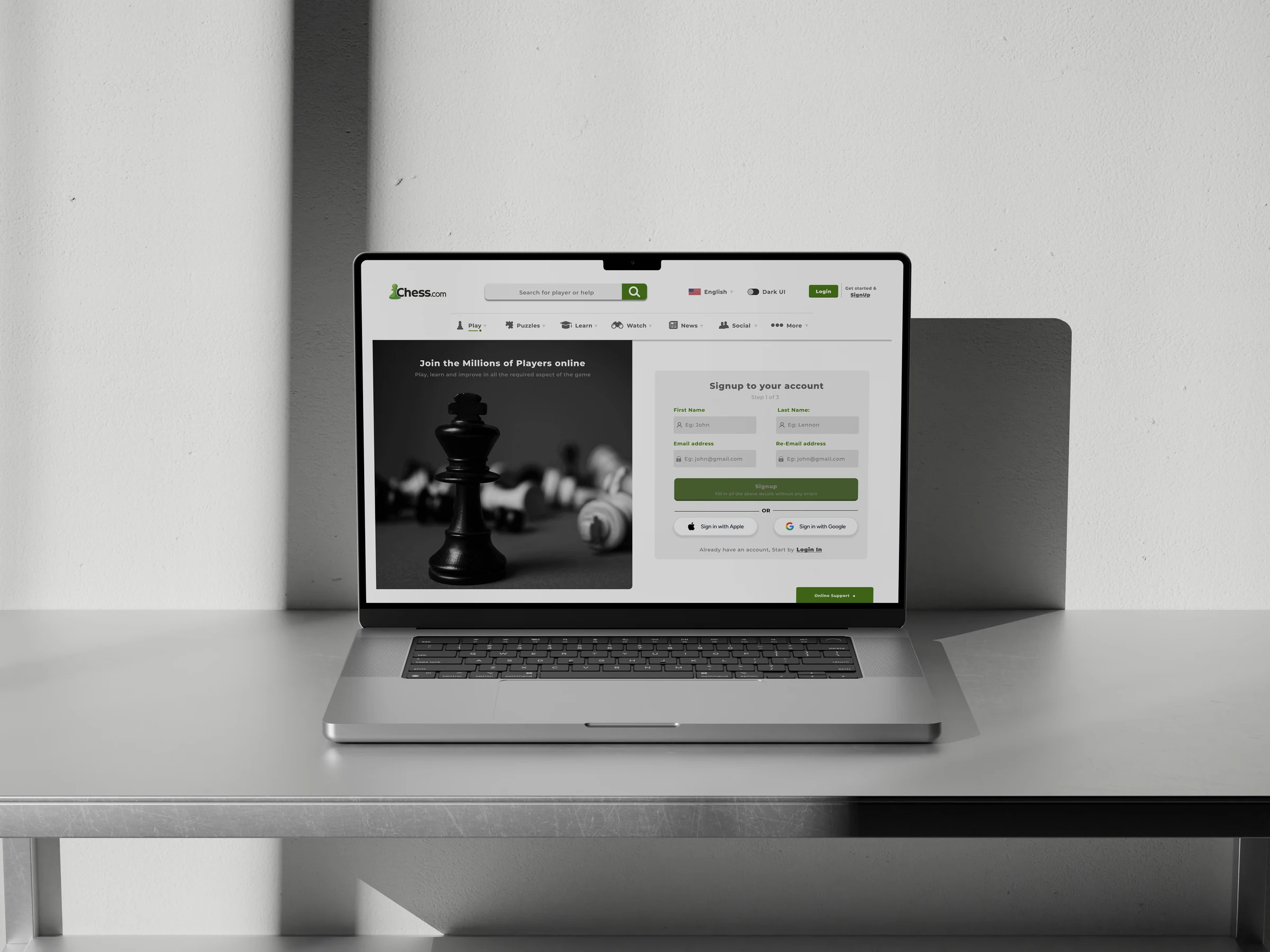
Chess.com play versus computer screen used as onboarding case study visual

Projects / Chess.com Onboarding

Chess.com
Onboarding

Project
Chess Platform
UX redesign & Heuristic Evaluation
Role
Product Designer
Research & Design
Timeline
2 Weeks
Research → Delivery
Tools
Figma & Miro
Design and research
Type
Personal Project
01 / Situation

Problem &
Solution

The Problem

Chess.com offers a vast array of features, but for a first-time user, the sheer volume of choices creates "decision paralysis." The current onboarding experience lacks a clear hierarchy of intent, forcing users to navigate complex menus before they can experience the core value of the product.

The challenge was shifting the focus from "explaining features" to "guiding intent."
The Solution

I redesigned the onboarding flow to be "Intent-Based." By implementing a series of high-clarity, low-friction decisions, the user can self-segment into specific paths (Play, Learn, or Practice) within seconds of entering the app.

The goal was to transform onboarding from a generic tour into a personalized, guided entry point.

02 / Task

The
Framework

Redesign the Chess.com onboarding experience for first-time users — reducing decision paralysis, shortening the path to first game, and creating an intent-driven entry flow that adapts to each player's goals.

Scope
End-to-end onboarding: account creation → intent selection → first game.
Target Users
New players (rated <800), casual learners, and returning users trying the platform for the first time.
Success Criteria
Time-to-first-game reduced by 50%, decision friction eliminated, first-session engagement increased.
03 / Action

Research
& Definition

03a / Evaluation

Heuristic
Review

01
Visibility of System Status
VIOLATED

Users receive no feedback during account creation loading states, leaving them uncertain whether the app is processing or frozen.

02
Match Between System and Real World
VIOLATED

Onboarding uses jargon-heavy terminology ("Bullet," "Rapid Chess," "Puzzles") without explaining what each mode actually involves in player-friendly language.

03
User Control and Freedom
PARTIAL

Players cannot skip the generic tour or select their own entry point. The flow forces a one-size-fits-all path that doesn't account for existing player experience.

04
Consistency and Standards
VIOLATED

Navigation patterns differ between the desktop site and mobile app. Menu structures and label conventions contradict each other, increasing cognitive load.

05
Error Prevention
VIOLATED

Account creation allows progression with incomplete email formats, only surfacing errors after submission — a classic point-of-friction moment.

06
Recognition Rather Than Recall
VIOLATED

Key settings (difficulty, opponent type, time controls) are buried deep in sub-menus. Users must remember their preferences across multiple screens.

03b / Analysis

Key
Pain Points

Decision Overload
New users are presented with 8+ choices simultaneously — too many options paralyze decision-making before they even play.
Navigation Complexity
The main menu mixes content types (learn, play, tools) without clear hierarchy, making it hard to find the user's intent.
Long Path to First Game
It takes 6-8 clicks and 3+ screens before a user can actually play — a frustrating barrier to experiencing the core product.
Error Fatigue
Sign-up and login flows show errors only after submission, forcing users to backtrack and re-enter information.
03c / Evidence

User
Feedback

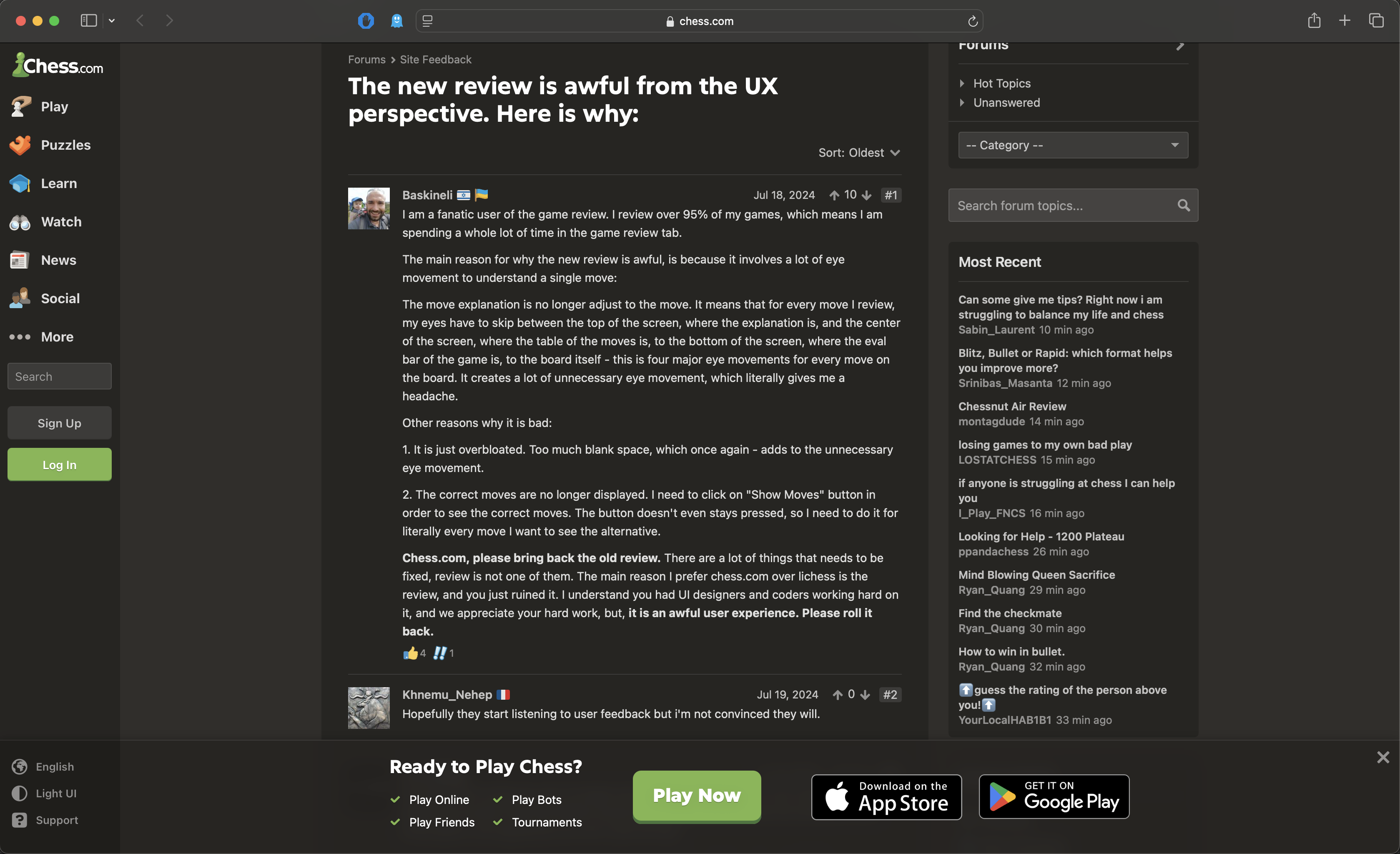
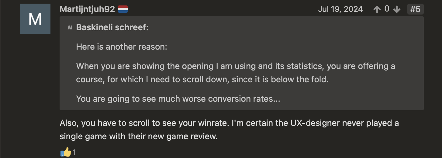
YouTube comment from frustrated user describing difficulty finding play options on Chess.com
Frustrated user comment — decision overload in platform navigation
Long YouTube comment from user detailing negative experience with Chess.com onboarding
Extended user feedback — path to first game too long
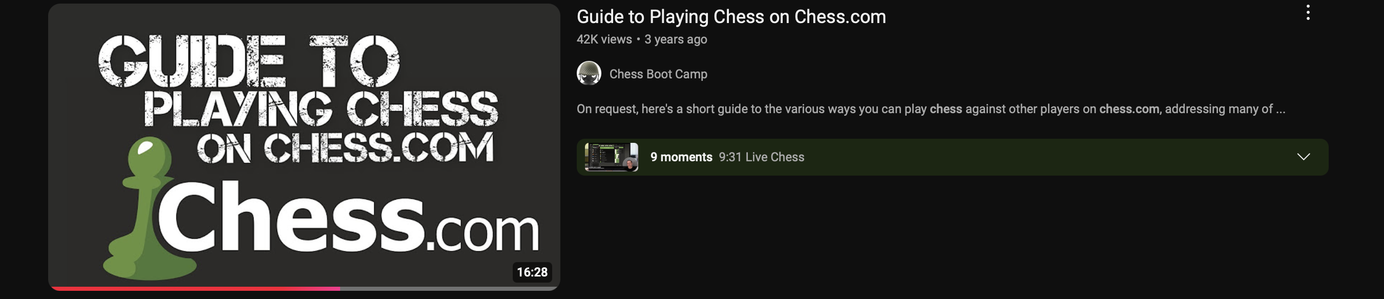
YouTube guide video showing how to play chess on Chess.com platform
External guide video — users must seek help outside the app
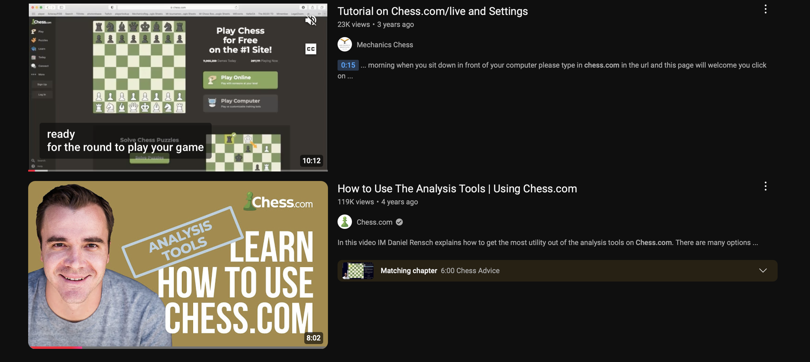
YouTube platform walkthrough video of Chess.com
Community walkthrough — onboarding clarity issues confirmed by users
03d / Process Artifacts

Miro
Boards

Heuristic
evaluation

User
Flow map

04 / Action

Design
Process

01
Discovery & Research

Identifying friction in the entry path.

I analyzed the user entry points to understand how new players interact with the interface. The core friction point was the "choice overload" presented immediately upon account creation.

02
Definition

Mapping user intent to product paths.

I defined three primary user personas: the 'Casual Learner,' the 'Competitive Player,' and the 'Quick Match-maker.' This allowed me to structure the onboarding around clear, intent-driven decision points.

03
Ideation & Prototyping

Reducing cognitive load through visual hierarchy.

Using Figma, I developed a step-by-step guided flow. I focused on a "One Choice per Screen" philosophy to prevent overwhelm, using high-contrast visual cues to direct user attention toward the next logical action.

04
Validation

Testing for clarity and momentum.

I evaluated the prototypes to ensure that real-time feedback (such as error handling and selection confirmation) provided the necessary reassurance to keep users moving forward through the flow.

05
Outcome

A frictionless path to the first game.

The final design ensures that the user's first session is defined by a "Small Win" — getting them into a game or lesson as quickly and confidently as possible.

05 / Action

Visual
Validation

05b / Prototype

Interactive
Prototype

Test the full onboarding flow — from sign-up to first game. Tap through each screen to experience the intent-driven journey.

06 / Result

Impact
Signals

As a concept study, these metrics represent target KPIs designed to validate the effectiveness of the proposed onboarding redesign.

1
Clear intent per session
50%
Reduction in time-to-first-game
3x
Increased path diversity
07 / Conclusion

Effective onboarding is not a tutorial; it is a conversation. The goal is to reduce the distance between a user's curiosity and their first successful interaction with the product.

Next
Walter
← All projects